As early as the introduction of his book “Interaction of Color”, which was published by Yale University Press in 1963, Josef Albers writes: “In visual perception a color is almost never seen as it really is – as it physically is. This fact makes color the most relative medium in art.”
With these words Albers, who at the time of the book’s publication was already 75 years old, touches upon something which has long been considered an extremely liberal realization: One does not just see what the mind knows, as Goethe put it. The example of color perception demonstrates that one sometimes fails to see what is actually there – even contrary to already knowing it better! And that’s not all: It is virtually impossible for a person, according to Albers, to remember a specific color tone. And even though there is an inconceivable variety of colors, everyone quickly reaches their limits here: It is only for a fraction, perhaps 20 or 30 seconds, that we are even able to find a name.
#TheDress is comparatively old news
So what happened? Over 50 years before the internet phenomenon of “#TheDress”, which demonstrated to even the greatest of skeptics among us just how unreliable your own color perception is, Josef Albers and his students were already carrying out comprehensive studies into the mutable effect of colors. Here Albers referred to Kandinsky, among others, who had already researched the topic of perception as the ultimate starting point for any kind of art in books like “Point and Line to Plane” and who, like Albers, had come to a similar conclusion: Fine art depends much more on the “how” than on the “what”.
In visual perception a color is almost never seen as it really is – as it physically is. This fact makes color the most relative medium in art.

Josef Albers via fontblog.de
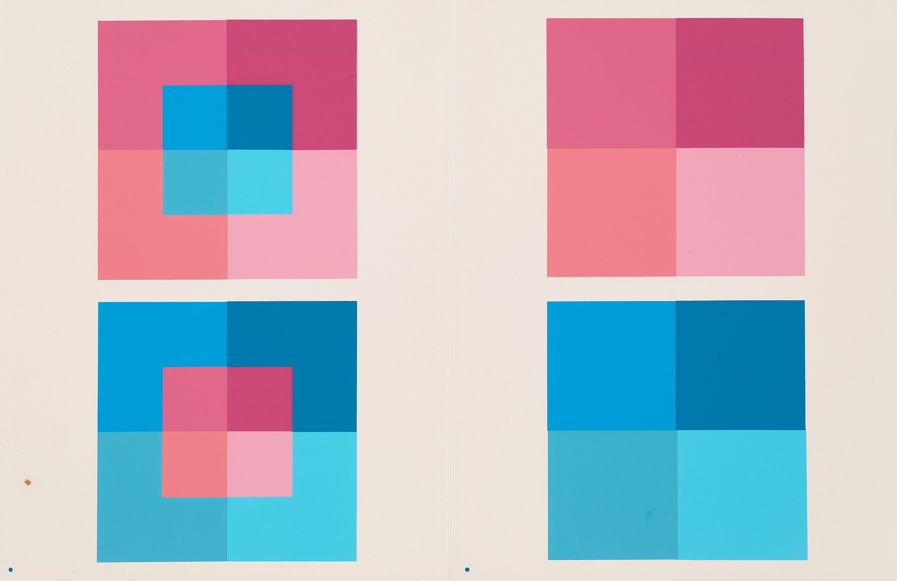
Albers recorded his findings so they were easy to understand, broke them down into individual chapters, and assigned to each a corresponding color chart. Ocher-colored and brown-green diagonals on a red and white background, slanted stripes in various shades of red and blue, the secret of which only comes to light when you follow the accompanying exercise. It is with the subtractive color synthesis at the latest that you quickly gain an idea of your own limitations: It’s plainly impossible to see what is so obvious here! Even if you really do know better, have a knowledge of art theory and have grown skeptical due to the optical illusion images so popular in the 1990s, you can’t help but despair at the experiments that Albers and his students arrange so comprehensibly here: You know that this light grey and this near-black are the same color, you can even check it using simple tricks, but it is all to no avail, since no exercise and no meditation can reconcile perception and reality. Compared to a complete reading of this reference work, “#TheDress”, and the admittedly long evenings of discussion it prompted regarding the question of whether that photographed dress was actually striped white and gold or black and blue, are really just yesterday’s papers.
A Bauhaus expert in the USA
Summarizing Josef Albers’ comprehensive achievements in just a few sentences is a fruitless task. Perhaps “Interaction of Color” is therefore better than any biography: Here the linchpins of his work, his work as an academic prior to developing any theory, his enthusiasm both for analytical questioning as well as for entirely tangible experiments and, not least, Albers’ talent – much lauded by his students – as both a teacher and an artist, are brought together in concentrated form in one work.

#TheDress, Image via wired.com

Josef Albers, Interaction of Color, Image via bukowskis.com
Josef Albers was born in the rural Westphalian town of Bottrop in 1888, and there he grew up. After his education he worked as a teacher, before visits to museums inspired him to explore modern painting. Works by artists like Paul Cézanne were to shape his career: Following his studies at Essen Art College and the Munich Academy of Art amongst others, Albers’ path took him to Weimer and the famous Bauhaus, where he initially studied and later, along with colleagues and in the role of Executive Director, even became one of the experts at the art school. From the beginning, teaching and artistic work were inextricably linked for Josef Albers.
Thinking in color? On the revolutionary ideas of Josef Albers
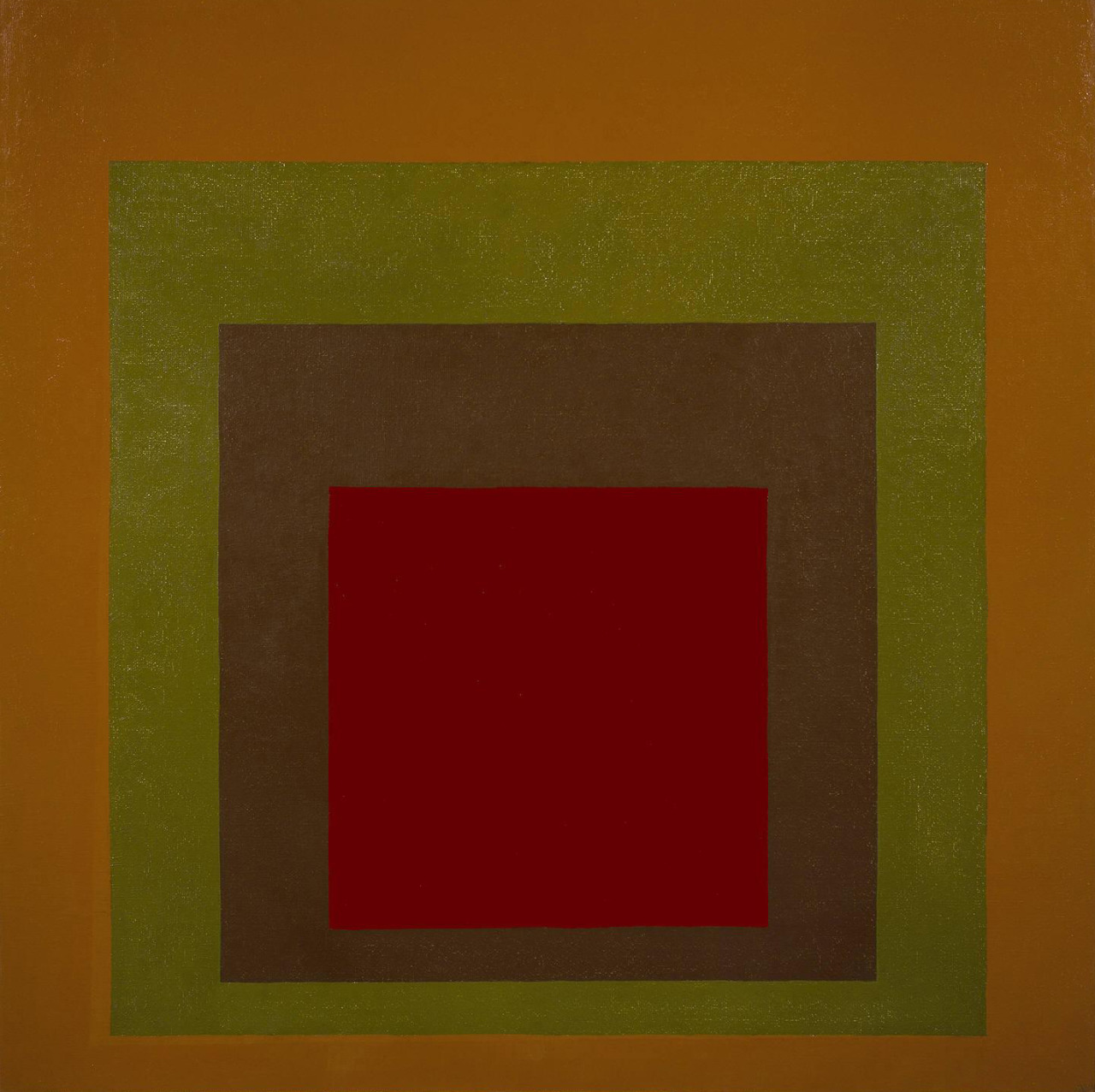
After his emigration to the USA in order to flee increasing Nazi repression, he quickly again made a name for himself as an outstanding teacher to those who would later become big names themselves: Robert Rauschenberg was once a student of Josef Albers, as were Cy Twombly and several others. Albers worked according to the principle of interaction: To him, his students were valid partners in researching colors on a par with artistic colleagues and art theorists. Of all his artworks, “Homage to the square” from 1959 is probably the best known – this composition of colorful, interlocked squares is another invitation to the observer to discover the interaction of the relevant colors in a continually unvarying form with his or her own eyes.

Josef Albers, Homage to the Square: Glow, 1966, Image via dwell.com
A good 25 years before Peter Halley held a copy of “Interaction of Color” in his hands for the first time, the book was getting extremely mixed reviews: While it did indeed sell very well soon after its publication, the intellectual public objected to Josef Albers’ methods. Many a critic denounced the book as a purely pedagogical concoction with no relevance to the current discourse on art; it was even said if anything to be imbuing the young art generation with bad taste by suggesting, so the quintessence of the reviewers, that all was relative. As so often when there is great resistance, more is revealed about the aggressors themselves than about the butt of their criticism: Perhaps Josef Albers’ critics sensed that to him a great deal was at stake. An academic at the University of Nevada in Las Vegas summarized what made up the core of Josef Albers’ work, his interest in research and his analysis:
In an age in which increased human sensibility has become such an obvious need in all areas of human involvement, color sensitivity and awareness can constitute a major weapon against forces of insensitivity and brutalization.
Such great hopes sounds slightly pathetic today, but are not unusual for the time shortly before the “Summer of Love” and the promise of a better world that went hand in hand with it. And despite this, it is possible to defend them against the disappointing reality: Like a philosophical study which, counter to common practice today, only actually offers any added value if one single idea of your own arises thanks to it, “Interaction of Color” can be understood as an initial spark encouraging you to think for yourself, to think in color. Once those qualities that had been considered certainties start to crumble, then all the others fall apart like a house of cards: geometry, hence form, and several others going forward from here.
The loss of all certainties, according to Albers, is not a drama in itself, but rather a necessary catharsis in order to delve more deeply into the material and thus actually to reach real findings in the first place. After all, the color studies were not intended to wreak destruction for the sake of it, but rather to facilitate a keen sense of visual perception – a prerequisite for every fine artist, hence Albers’s conviction that the “Interaction of Color” was, not least, the basis for a color wheel yet to be created. That set him apart from his critics who primarily saw a threat in the consistent analysis or simply deny its revolutionary potential alone for the quite practical work that is art.

Josef Albers, Homage to the Square: Gained, 1959, Image via funnybunnymusic.tumblr.com