At first glance Peter Halley’s works appear minimalist. Yet they are notably different to the Minimal Art of the post-War period: In Halley’s oeuvre, geometry loses its innocence.
The style of Minimal Art evolved in the 1960s in the USA as a response to the emotional gestures of Abstract Expressionism and the trivial iconography of Pop Art. Its representatives included, for example, Donald Judd, Carl Andre, Dan Flavin, Sol LeWitt and Robert Morris. These artists used industrial materials and manufacturing methods to create elementary, frequently geometrical shapes in serial, non-judgemental configurations, with flawless surfaces and without any discernible personal touch. The result was not paintings, but rather sculptures, destined to exclude any illusionist, metaphorical or symbolic interpretations or associations. Taken to an extreme the mindset even meant that Sol LeWitt refused to accept Flavin’s work with neon tubes as minimalist because it was reminiscent of the yellow light of the sun.
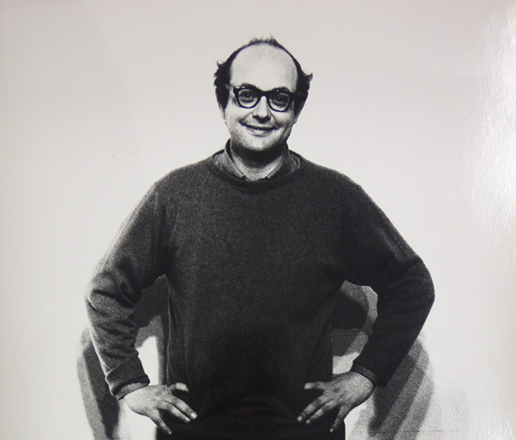
Sol LeWitt (1928 – 2007), Image via guggenheim-bilbao.eus
Pieces of Minimal Art still appear contemporary to us today, even though most of them are now over 50 years old. The simple forms of Minimal Art had already gained a foothold in architecture and design by the 1980s and are now ubiquitous – one need look no further than the “Billy” shelves by Ikea. But it has not only been since Geometric Abstraction or Minimal Art that geometric shapes have been used in art. Ever since the Renaissance painters have attempted to elevate reality through geometrization – including by basing a picture on a triangular composition. That said, outside of art, geometry has often been associated with positive notions such as transcendence, democracy, reason, progress or beauty.
Generating attention
In creative terms, Peter Halley’s works exhibit some elements comparable to Minimal Art: Halley likewise uses materials from industry. The orange color in the work exhibited at the SCHIRN is a Day-Glo paint, and has a fluorescent effect in daylight. Halley came across these paints in the supermarket and on packaging – bright colors intended to generate attention. This colorfulness makes his images appealing – the same quality that makes such paints interesting for the advertising industry, for example – but at the same time evokes a bothersome glare. In Halley’s work “The Schirn Ring” in the rotunda of the SCHIRN this irritation can even be experienced in the three-dimensional space.
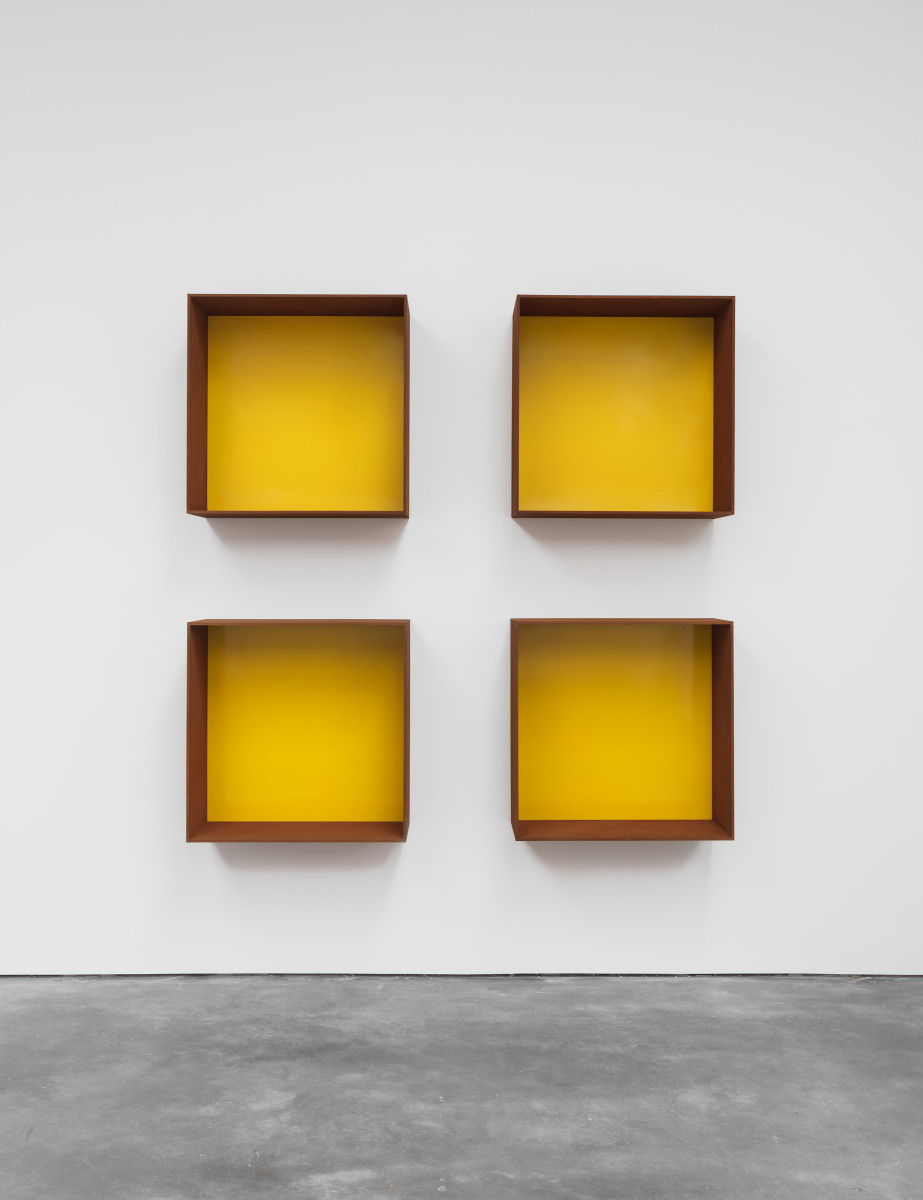
Donald Judd, Untitled, 1991, Image via guernicamag.com
Furthermore, Halley uses “Roll-a-Tex”, a type of artistic plaster rendering used in the construction industry, in order to apply textures to walls. “Roll-a-Tex” can also be found on the painting in the SCHIRN. In 1982 in his “Notes on the Paintings” the artist wrote that this plaster texture is reminiscent of the ceilings of motels. Halley uses this material for his paintings as an indication that they are not purely geometrical shapes, but are intended to represent real spaces. It is here that the big difference with Minimal Art becomes clear.
Referencing the real
Both through the titles of his works and through his comprehensive theoretical writings, Halley demonstrates that, unlike Minimal Art or “geometric art” in general, his right angles reference something real. The painting exhibited in the SCHIRN bears the title “Rectangular Prison with Smokestack”; alongside the concept of “prison”, those of “cell” and “conduit” also occur frequently in the titles of his pieces made in the 1980s.

Halley was born in New York and returned there in 1980 after having lived in New Orleans for some time. He started to view the city through different eyes and to see it as a “geometric machine”. In 1985, Halley wrote about life in apartments in his essay “On Line”: “The cell. Its ubiquity reflects the atrophy of the social and the rise of the interconnective. At the same time that the advent of piped-in ‘conveniences’” has made it unnecessary to leave the cell, it has also made it impossible to leave the cell. One finds oneself stuck at home waiting for a phone call.” Geometry as a symbol, therefore, for communication structures that determine our everyday lives. The home as a cell or prison, supplied with power, water and communication via conduits. The geometric layout of the city, the houses and streets as a means of power and repression.
Quoting geometry critically
The systematic growth of American cities enabled Thomas Jefferson, the founding father of the United States, to push forward grid systems for the colonization of the United States in the eighteenth century. However, the development of cities in right angles had existed since ancient times and is known as the “Hippodamian plan”. It was intended to make mobility easier, but at the same time served for spatial control. Thus Napoléon III had Georges-Eugène Baron Haussmann demolish the medieval, winding streets of Paris, partly as a way to enable easier suppression of rebellious citizens, and give it a clearer layout with visual axes. Philosophers like Michel Foucault and Jean Baudrillard have written in great detail about the phenomenon of geometrization of space, and Halley frequently refers to such writings in interviews and texts. The formal leanings towards Minimal Art in his oeuvre should therefore be understood more as a critical quote than as concurrence in terms of content.

Peter Halley, Image via peterhalley.com

Radially concentric created streets in Washington, D.C., Image via wikipedia.org
Hans Haacke in New York
Hans Haacke has lived and worked in New York City since 1965. Reason enough to take a closer look at his relationship with the “Big Apple”: From his...
These boots are made for walking
Shoes are silent storytellers, revealing secrets about their wearer's personality, status and desires. No wonder, then, that artists like Carol Rama...
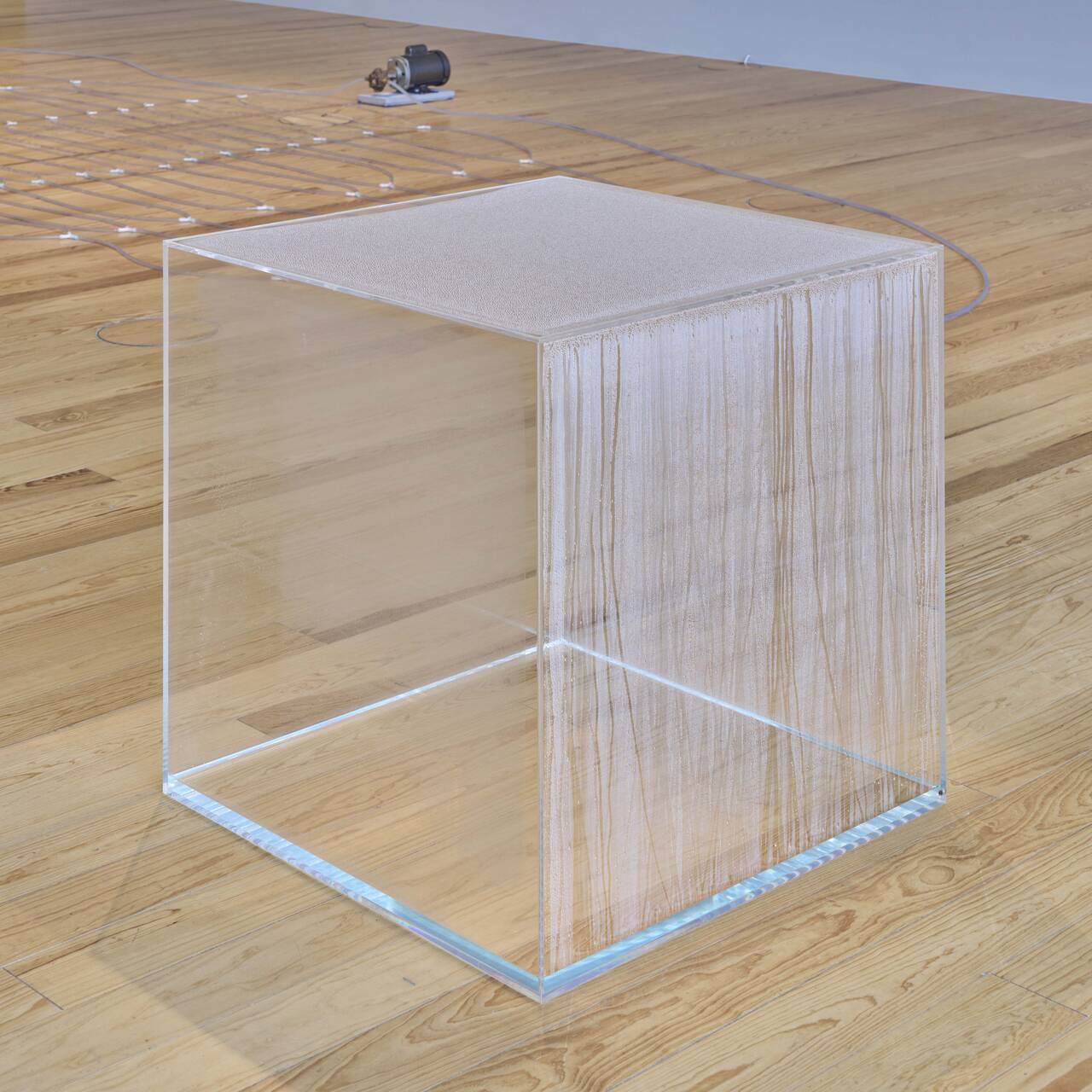
Seeing nature anew – through a cube
In his early work, HANS HAACKE addressed the relationship between art and nature as well as the social interest in the reciprocal relationship between...
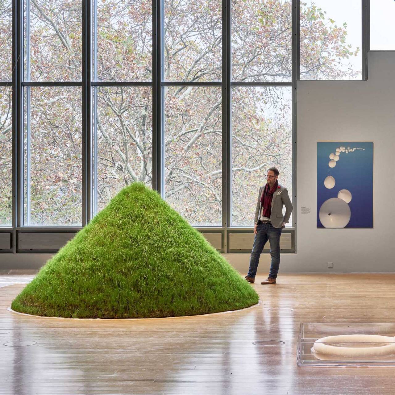
The film to the exhibition: Hans Haacke. Retrospective
A legend of institutional critique, an advocate of democracy, and an artist’s artist: The film accompanying the major retrospective at the SCHIRN...
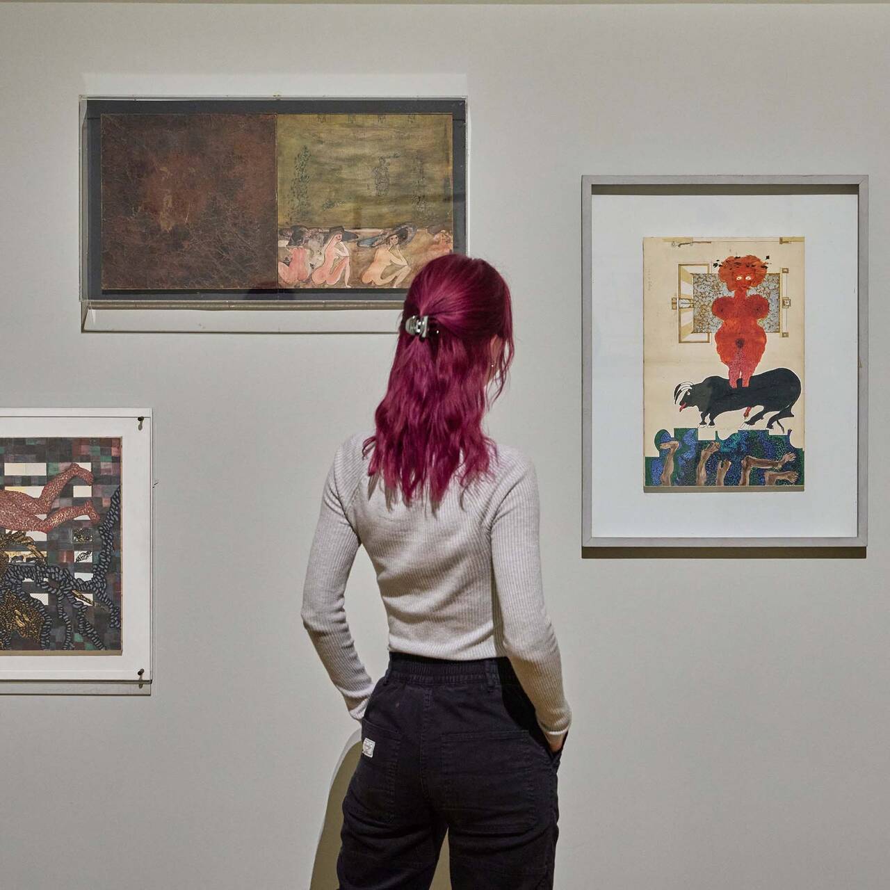
A new look at the artist – “L’altra metà dell’avanguardia 1910–1940”
With “L’altra metà dell’avanguardia 1910–1940”, in 1980 Lea Vergine curated an exhibition at the Palazzo Reale in Milan that was one of the first...
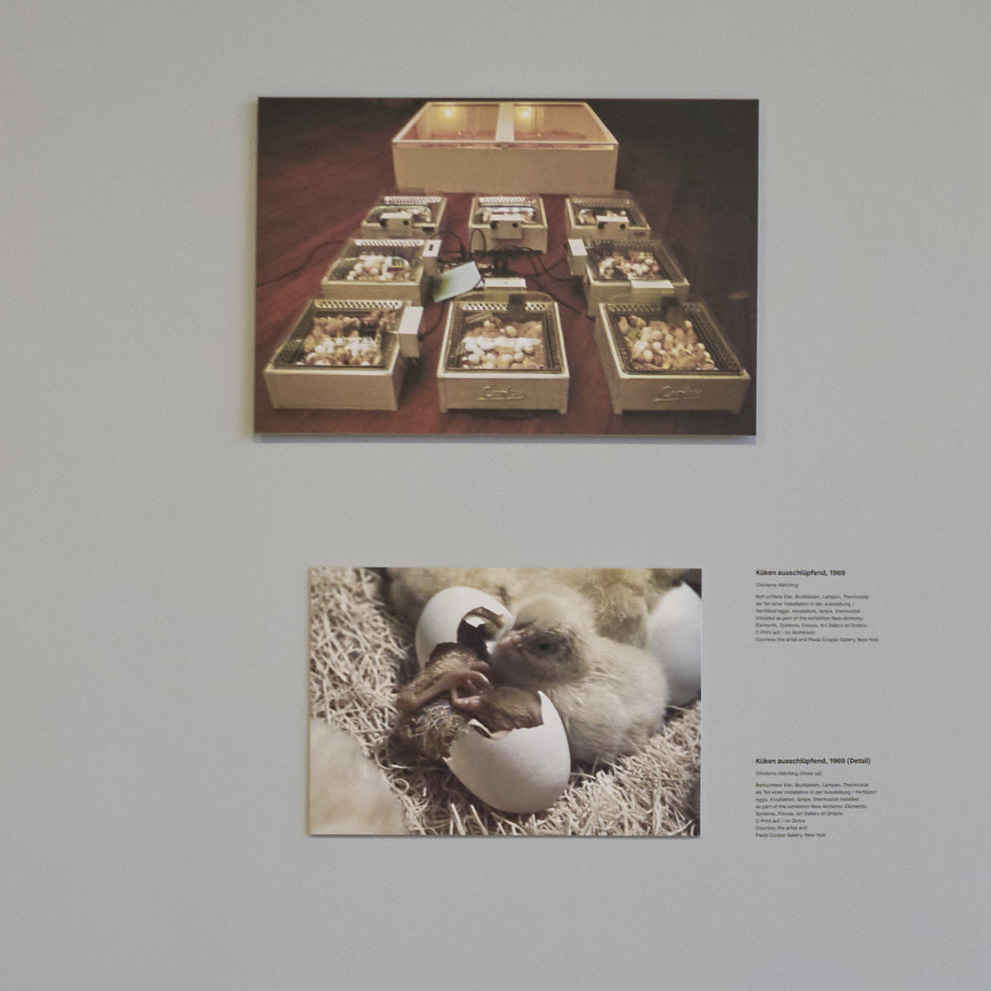
Non-human living sculptures by Hans Haacke and Pierre Huyghe
In his early work, HANS HAACKE already integrated animals and plants as co-actors into his art. In that way he not only laid the foundations for a...