
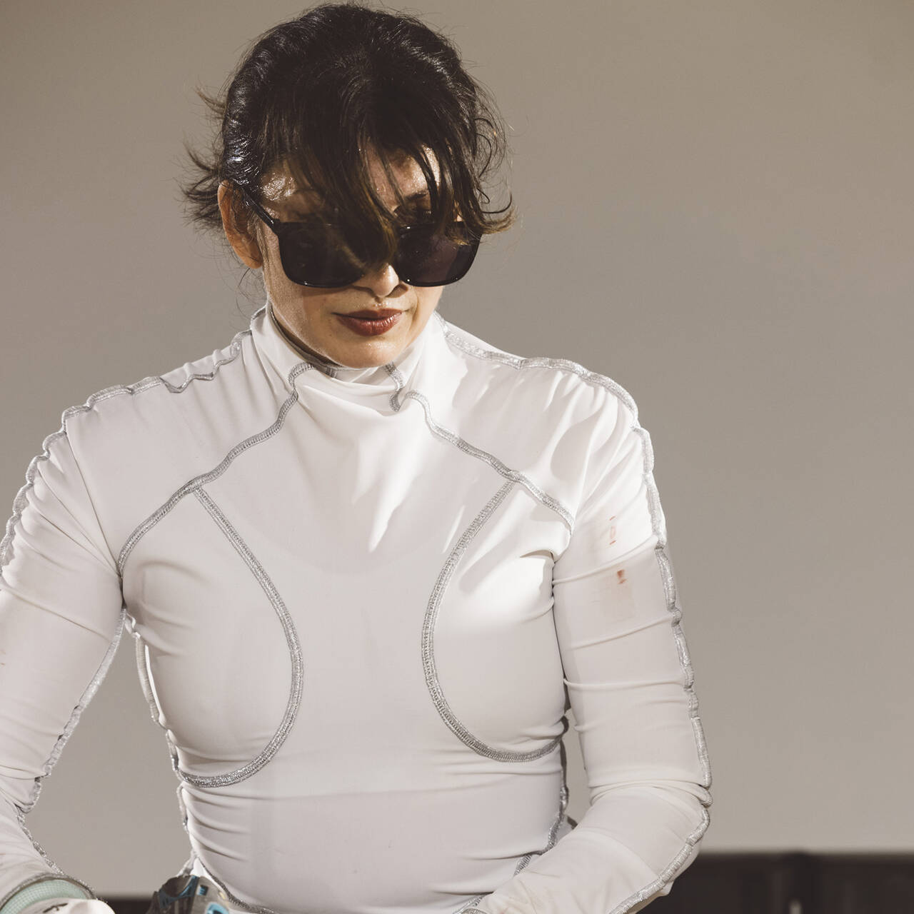
An interview with graphic designer Christoph Steinegger, who has created what is in many ways an extraordinary catalogue for the ULAY. LIFE-SIZED exhibition.
In the Ulay. Life-Sized exhibition there are surprising details just waiting to be discovered. Hence, for example, the attentive observer will see screens with video works hidden behind the exhibition walls proper. And a closer look at the catalogue will likewise reveal much that is otherwise unseen.
Christoph, how did you begin developing your graphic ideas for the catalogue?
When curator Matthias Ulrich called and asked me whether I would be interested in creating the catalogue for the Ulay exhibition, I really only knew about Ulay’s collaboration with Marina Abramović, so I started by doing quite a bit of research. If I’m going to do something, then I want to know as much as possible about it. There is a book about Ulay published in Amsterdam that is outstandingly good and is beautifully designed. The publishers drew on unlimited resources, so I got a bit stuck on that at first. I then watched countless YouTube videos and lectures by Ulay, put the layout on the back burner and set about tackling the research. The research was time-consuming, but at some point the wall I was facing crumbled and the idea came to me: Perhaps the book should be laid out like Ulay’s style of work, which I perceive to be unbelievably rigorous and harsh. So it became precisely the opposite of the Amsterdam catalogue: very few extravagances, but rather harsh, a single font in a single size.

The font in the catalogue reminds me of Ulay’s very first artistic works.
At the beginning of his artistic career, Ulay created works he called “aphorisms”. These were A4 sheets on which he placed text using a typewriter. The font in the catalogue is based on Ulay’s first attempts at artistic expression. The typewriter is not able to make the font smaller or larger, so all the texts in the catalogue are the same size, regardless of whether they are footnotes, titles, captions or the main body of text.
Even the title on the cover is the same size and is therefore unusually small. Can you tell us how the cover developed?
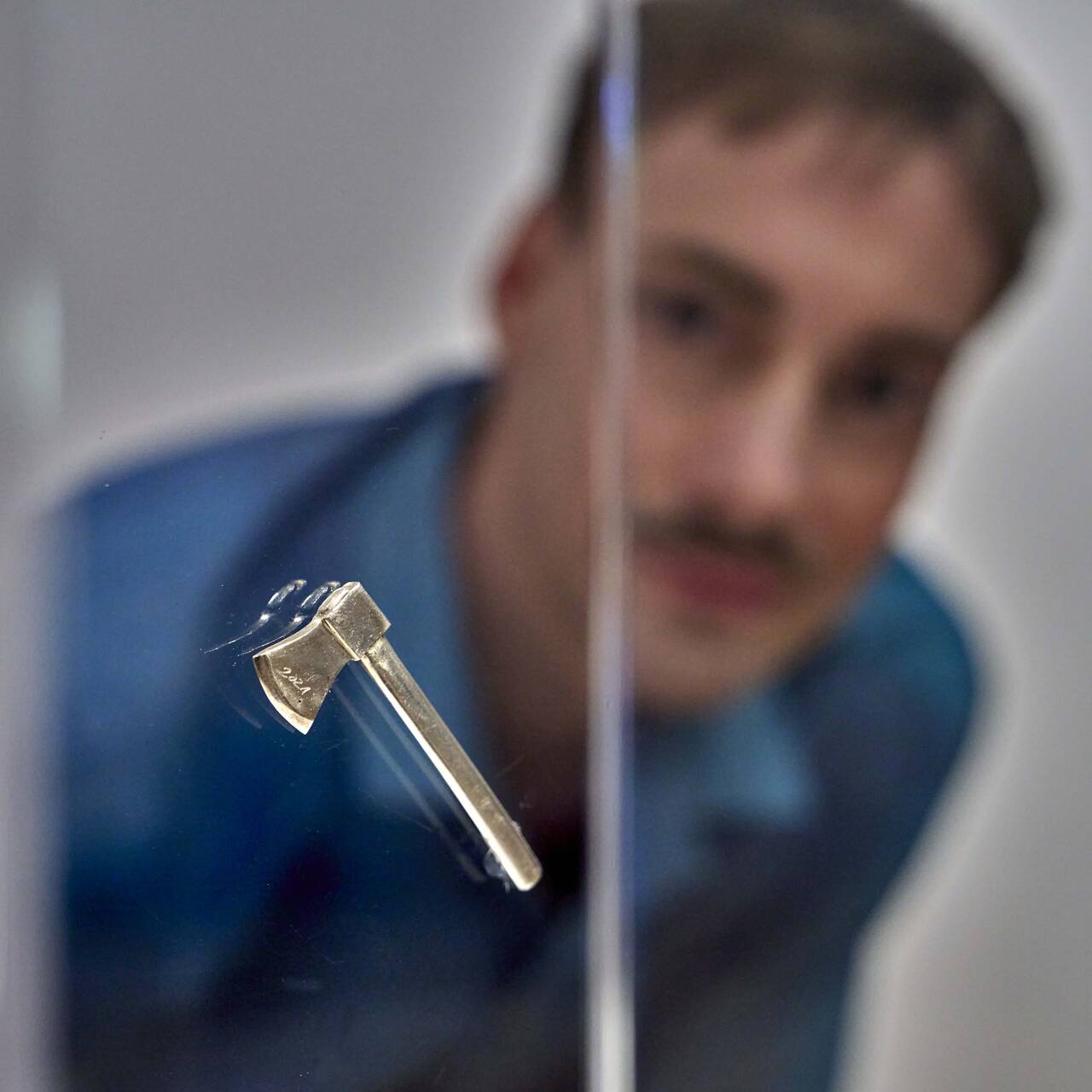
The book was already well underway when I started to tackle the cover. Since the exhibition is entitled “life-sized”, I was determined to use a portrait of Ulay as a motif. I asked the curator to ask Ulay how big his head is: It is 23.5 cm from his forehead to his chin not including the beard, so the picture on the cover is also that size.
The book and its cover are joined in an unusual way, very directly like paper.
I wanted to do without a protective varnish. The printer objected, saying the cover without varnish would chip off very quickly, but that’s precisely what I wanted. Firstly due to the environmental aspect, but on the other hand it also hints at Ulay’s works. In “Retouching Bruises” for example, Ulay works on Polaroids using fingerprints. If the exhibition catalogue is used – and books should be used – then fingerprints are left on it.

You also spoke about an environmental aspect, what do you mean by that?
Ulay’s oeuvre includes an examination of water and how people deal with this resource, so as well as doing without the environmentally harmful protective varnish, I wanted to use a type of paper with a better water balance than that of acid-bleached printing paper. The catalogue is therefore printed on recycled paper. Originally I considered using a relatively new paper known as stone paper. It is made not from wood, but from ground-up stone and therefore has a very good water balance. The problem with this paper at the moment is that it is too expensive, but I hope that stone paper will soon be affordable.
What other influences has Ulay’s art had on the design of the catalogue?
When you open the catalogue, you see the matt-black reverse of the cover on the left and a silver endpaper on the right. The original Polaroid packaging was matt-black and shiny silver, so we toyed around with this Polaroid packaging a bit. The silver endpaper is not only an effect because it looks nice, but therefore also has a background that relates to the content, in line with Ulay’s saying that “aesthetics without ethics are cosmetics”. In my work as a graphic designer it’s important to design things that stand to reason as much as possible.

And the medium of Polaroid as a point of reference certainly stands to reason, as Ulay has frequently worked with this sort of instant photography.
Another aspect that relates to Ulay’s art in the production of the book came towards the end: I was given a bookbinding sample by the printing company. You get a bound book made with a selected type of paper and can see how thick the book is and the way it opens. The catalogue opens up very nicely thanks to the recycled paper, which also means you can see the binding threads. Ulay’s work “Pink Pain” …
… which is part of his new “pink phase”, which began in 2015 …
… gave us the idea of using a pink binding thread to bind the book. It’s a subtle element that people will either like or think silly. Personally I really like adding little twists like that to books.
Christoph, thank you for talking to us!


Baby, you can drive my car
For many years now, the art world has had a (love) relationship with cars, be it as a way of representing speed or critical reflection on consumerism....
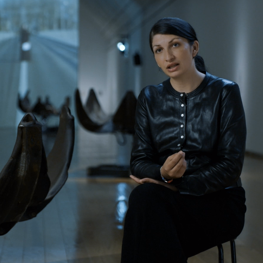
The film to the exhibition: Selma Selman. Flowers of Life
Only a few years ago, she boldly and confidently entered into the spotlight of the international art world. In this video interview, she talks about...
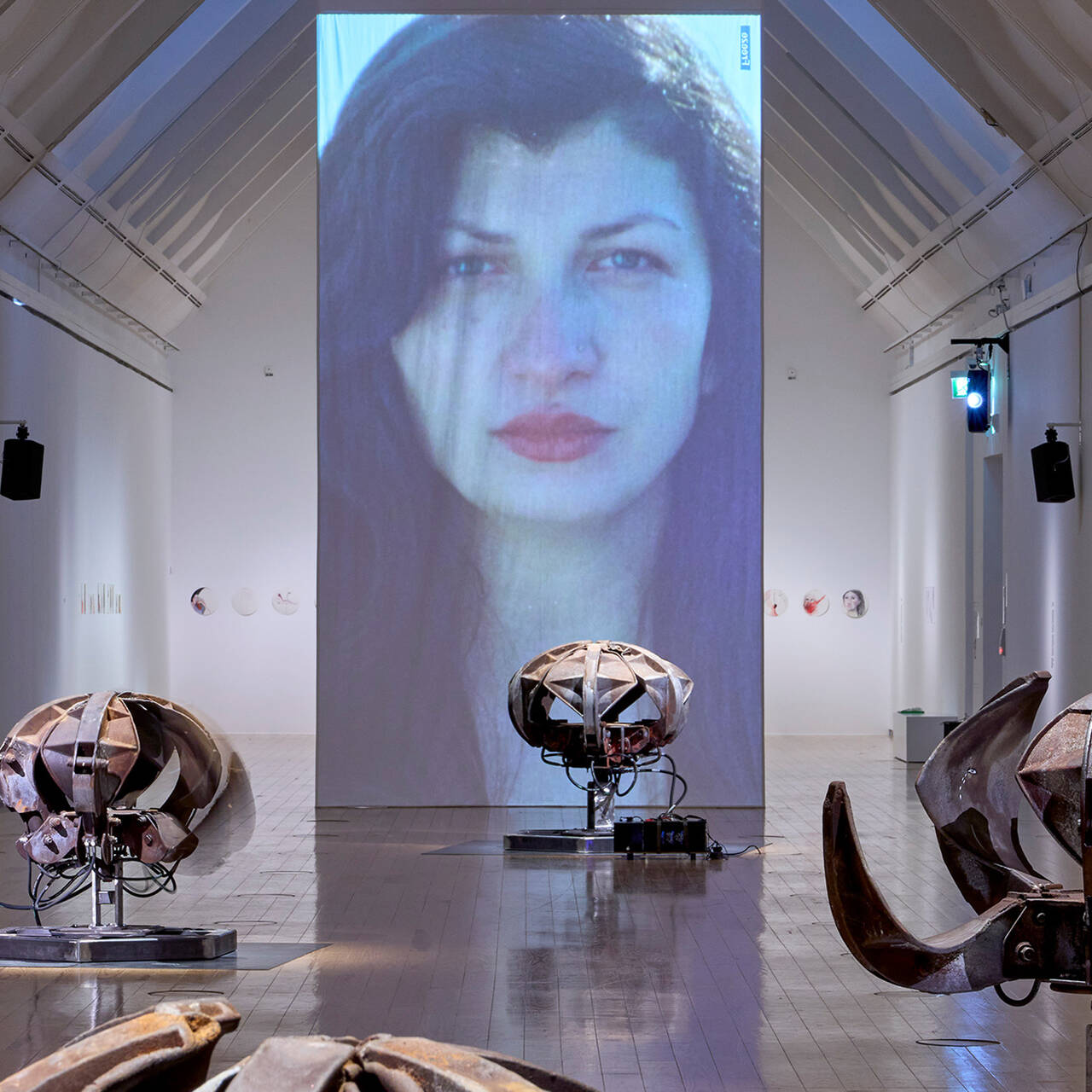
Selma Selman and the elastic fabric of the Self
SELMA SELMAN's artistic practice cannot be described as site- or situation-specific; rather, it seems to deal with the self and its constant...
Now at the SCHIRN: CASABLANCA ART SCHOOL. A POSTCOLONIAL AVANT-GARDE 1962–1987
The Moroccan “New Wave”: The SCHIRN presents the influential art scene around the CASABLANCA ART SCHOOL in a first major exhibition in Germany.
FIVE GOOD REASONS TO VIEW SELMA SELMAN IN THE SCHIRN
Poetic, confrontational, surprising: from June 20 to September 15, the SCHIRN presents two new works by the artist SELMA SELMAN in a large solo...
Doing nothing is (not) at the core of the work
Jovana Reisinger reflects on idleness in Cosima von Bonin’s work – is it a sign of luxury, slovenliness, or ultimately a much more meaningful and...