You might think that these days, film backdrops are all created on a computer. SCHIRN MAGAZINE meets set-builders who have painstakingly built everything by hand for their new sci-fi movie.
Alexandra Exter wrote cinematic history in 1924 with her futuristic costumes and the set for the sci-fi film “Aelita”. The fact that the film by director Yakov Protazanov is considered a pioneering work of Soviet cinema can be attributed in good part to the image worlds that then, as now, brought the viewer under their spell.
On a mission to find people who are still experts in handmade sets and effects, even in our current age of computer-generated images, SCHIRN MAGAZINE took a trip to the Siegerland to meet a four-man crew of young filmmakers: Marcel Barion, Massimo Müller, Johannes Bade and Philipp Bojahr discuss creating captivating film worlds, science fiction, and of course their current film “Das letzte Land” (“The Last Land”).
Over 90 years after “Aelita”, in these days of digital illusions, you rely on analog craftsmanship when it comes to creating your own image worlds. Why did you decide not to use computer-generated images?
Marcel Barion: It was a conscious decision not to use CGI [Computer Generated Images, ed.]. You might think that it was cheaper or easier to work with models and handmade sets – but that’s certainly not the case. It simply looks better.
Philipp Bojahr: If you take a look at films from the early days of CGI, such as “Star Wars Episode IV”, then ever since the 1990s and the Noughties the animations added after filming have actually looked out of place when compared with the very good masks of the late 1970s. Our viewing habits have changed so quickly that these animations are simply no longer state-of-the-art. I find that a good handmade model or set is much more timeless. These things age with dignity.

“Aging with dignity” is a rather nice concept. What do you like about the sets in “Aelita”?
Massimo Müller: I really like the way the characters interact with the set, when, for example, these huge machines have to be operated, or the conveyor belts are running. It’s nicely done.
MB: There are lots of crooked angles and edges, so it automatically makes me think of “The Cabinet of Dr. Caligari”, or of early Expressionist film in general.
PB: The geometrical shapes are also reminiscent of Oskar Schlemmer’s “Triadic Ballet”.
MB: Yes, in any case you see that the set is very strongly anchored in the artistic style of its day. The world on Mars appears very much “designed”, very clean. A technical setting that doesn’t reveal much about its function.
PB: No “form follows function”. [Ed: This is a key principle in design and architecture, according to which the design of anything must be derived primarily from its function.]
MB: Four years later, around 1928-9, Fritz Lang’s “Woman in the Moon” is already quite different. There the film set is characterized by technical apparatus, but with apparently banal little features like foot-loops on the floor, with which the astronauts get a grip when they become weightless. Meaning there is very precise consideration given to what functional elements there might be in a spaceship. This makes the illusion more credible for the viewer.


Exter’s focus is on expanding the area of the stage. With ramps, steps and conveyor belts, the whole spatial depth of the set becomes usable. Exter only indicates very vaguely how machines work or what purpose they serve. Your project “The Last Land” is most notable for the love of detail, for example when it comes to making a technical setting more credible with all the details of its signs of usage.
PB: When we began building the spaceship for “The Last Land”, all the components were visibly brand new. We initially built it as a new spaceship.
MM: But the spaceship in the film is old, so we covered the whole thing with a patina so that the individual components took on a homogeneous overall look.
Johannes Bade: This made the interior of the ship so dirty that some of the details, like the writing on the fittings, were no longer visible. Then we added the signs of wear and tear, using knives to scratch the paint and artificially rusting this steel hatch using salt water.
MM: The exciting thing was that we discovered the material and the components anew, as we had to consider a third function of design. [Ed: The visual design of objects points to their function (indicative function) and can also be perceived as a symbol of style, value or zeitgeist (symbolic function).] The components of the spaceship were originally designed for something else. We take them out of their original context and make them into part of the ship. Now they represent something different.


Just like the Rowenta iron or the Dahle pencil sharpener in “Space Patrol Orion” (1965)?
PB: Things need to be made alien, or they lose their magic. If, for example, an iron can be recognized as just that, then it won’t work for the viewer. For us it was important that we used a lot of things that represent something. Here we mainly used cathode ray tubes or old oscillators, because they conveyed the look of the times.
What times? The 1980s, or rather 1979, if one is reminded of Ridley Scott’s “Alien”?
PB: Yes, “Alien” was an inspiration to us, but the set of “Blade Runner” from 1982 and the interior of the Millennium Falcon in “Star Wars” were also influences we could all agree on in our work. We used components that are indicators of a “retro” aesthetic, because they have an aura of the time when science fiction films were made in the same way we make ours here too.
MB: The set should be a little bit like the third character. Its construction elements become performers. The spaceship in our film should speak to the viewer, not like Hal [the on-board computer in the film “2001: A Space Odyssey”, ed.], but rather in a figurative sense.
JB: Especially since a large proportion of the film takes place in the spaceship with just two actors. A chamber play in outer space. So it’s particularly important that the set is good.
PB: Now I have the problem when we’re filming that the actors are in my way as I’m trying to see the spaceship. [laughs] Viewer will never even notice some of the details of the set. We have a plan to show precisely which light, which control light, which oscilloscope or DVD player can be purposefully activated.


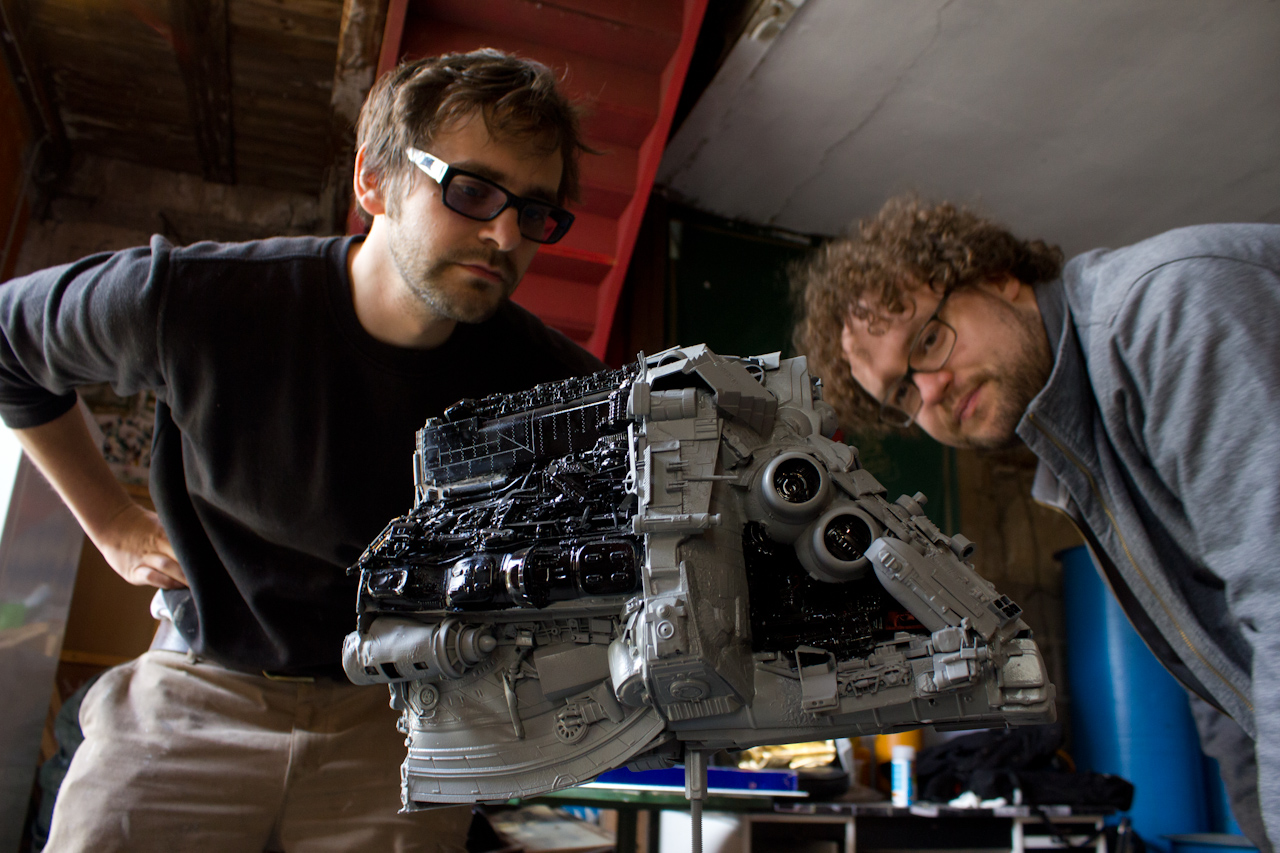
Massimo Müller and Marcel Barion working on the model of the spaceship, Das Letzte Land, 2016, via dasletzteland.de
The plan gives the impression that the spaceship can do more than the film requires it to?
PB: Yes, there is perhaps a greater love of detail than is really necessary, but that means you have lots more possibilities when filming. A small flashing light in the cockpit is not simply controlled at random, but rather programmed so that at specific intervals every four seconds a dice is rolled to determine which of the control lights are switched on or off. This way I ensure that the light field in the overall picture of the cockpit is always even.
MM: There are also sections in the spaceship which cannot be seen with any camera configuration – such as the air supply area.
Your love of detail begins even with the model of the space station, the elaborate reverse side of which one never sees in the film, or the cement in the mock gun to make it genuinely heavy.
MB: The viewer would notice if the props weren’t heavy. And the actors would too. It’s not just about my scope as a director and cameraman, but also about the feeling on set.

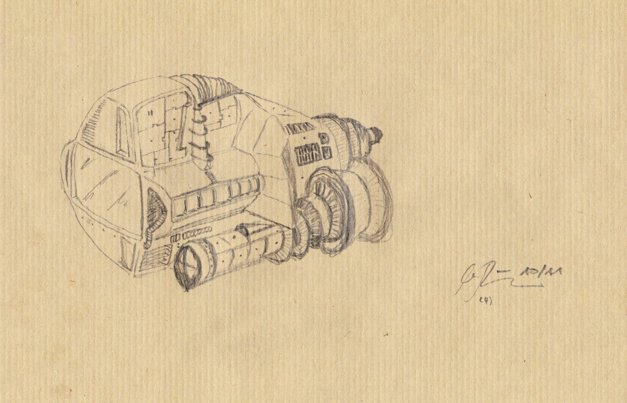
Sketch of the spaceship, Das Letzte Land, 2016, via dasletzteland.de

Revolution on Mars
The 1924 film ‘Aelita’ fundamentally shaped the genre of sci-fi movies. The futuristic sets created by the STURM artist Alexandra Exter played an...

DOUBLE FEATURE: PHIL COLLINS
In January’s DOUBLE FEATURE British video artist Phil Collins presents “Tomorrow is always too long”, his declaration of love for the city of Glasgow....