

historical turning point: Paul Gauguin discovered it for himself in 1889, Edvard Munch experimented with it in 1896, and the young generation of artists in Vienna turned their attention to it around 1900: The SCHIRN exhibition on the color woodcut allows you to trace the new impulses that revived one of mankind’s oldest printing techniques. On display are works by important members of the Viennese Secession as well as some artists who have by now almost been forgotten. The traditional technique gives free rein to the imagination and contributed to the popularization of Modern art around the turn of the century.
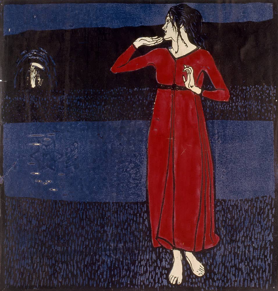
Erwin Lang: Girl in red dress (Grete Wiesenthal), around 1904.
Bastion of the arts
Around 1900 the metropolis on the Danube would already have been able to make a reputation for itself based solely on its astounding number of coffee houses. What really secured the city’s fame, however, was the concentration of artistic and intellectual heavyweights who appeared to be drawn to these public workshops and viewed them as their adoptive homes.
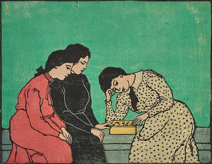
Emil Orlik: Three Girls playing a Board Game, 1906/08.
How swept away now are the final remains of the traditional copies and imitations, and the works of art have once again become that which they always were: newly created, born from the artist’s soul.
Ver Sacrum Journal 2, 1900, p. 21
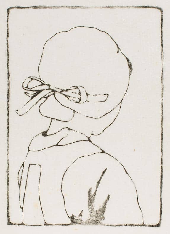
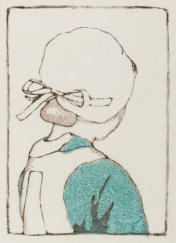
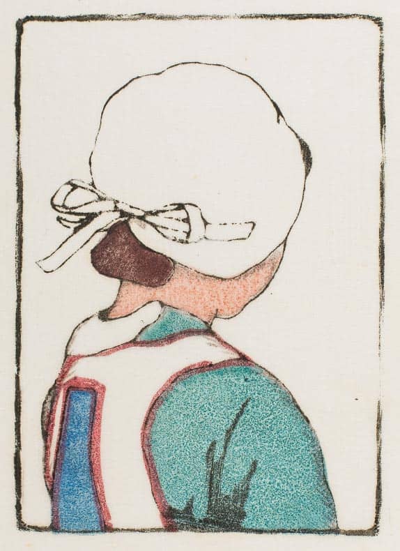
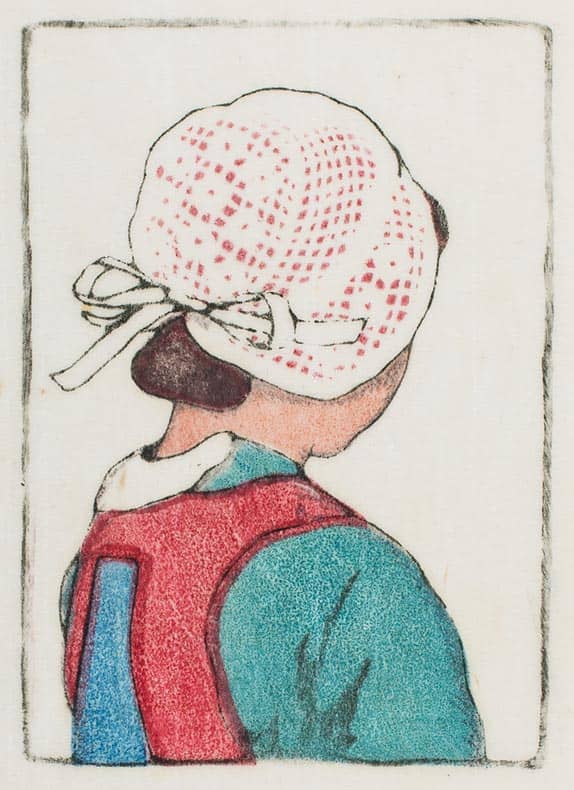
Carl Moser: The little Breton girl (different stages, plus final print), 1902.
A matter of opinion
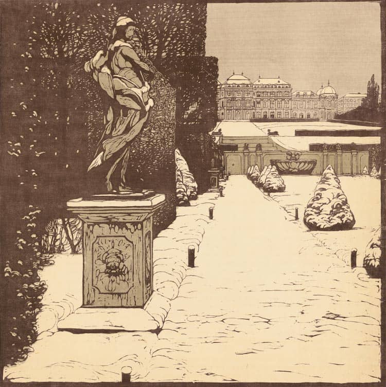
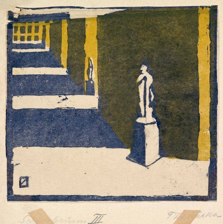
In the seat of imperial-royal power that is Vienna, there is a seemingly unending series of impressive sights. And naturally the Viennese color woodcut was to pick up on these popular subjects. The artists’ great delight in experimentation, however, resulted not in conventional depictions, but rather in an abstract reduction of form, outline and color.
A revolutionary
re-discovery
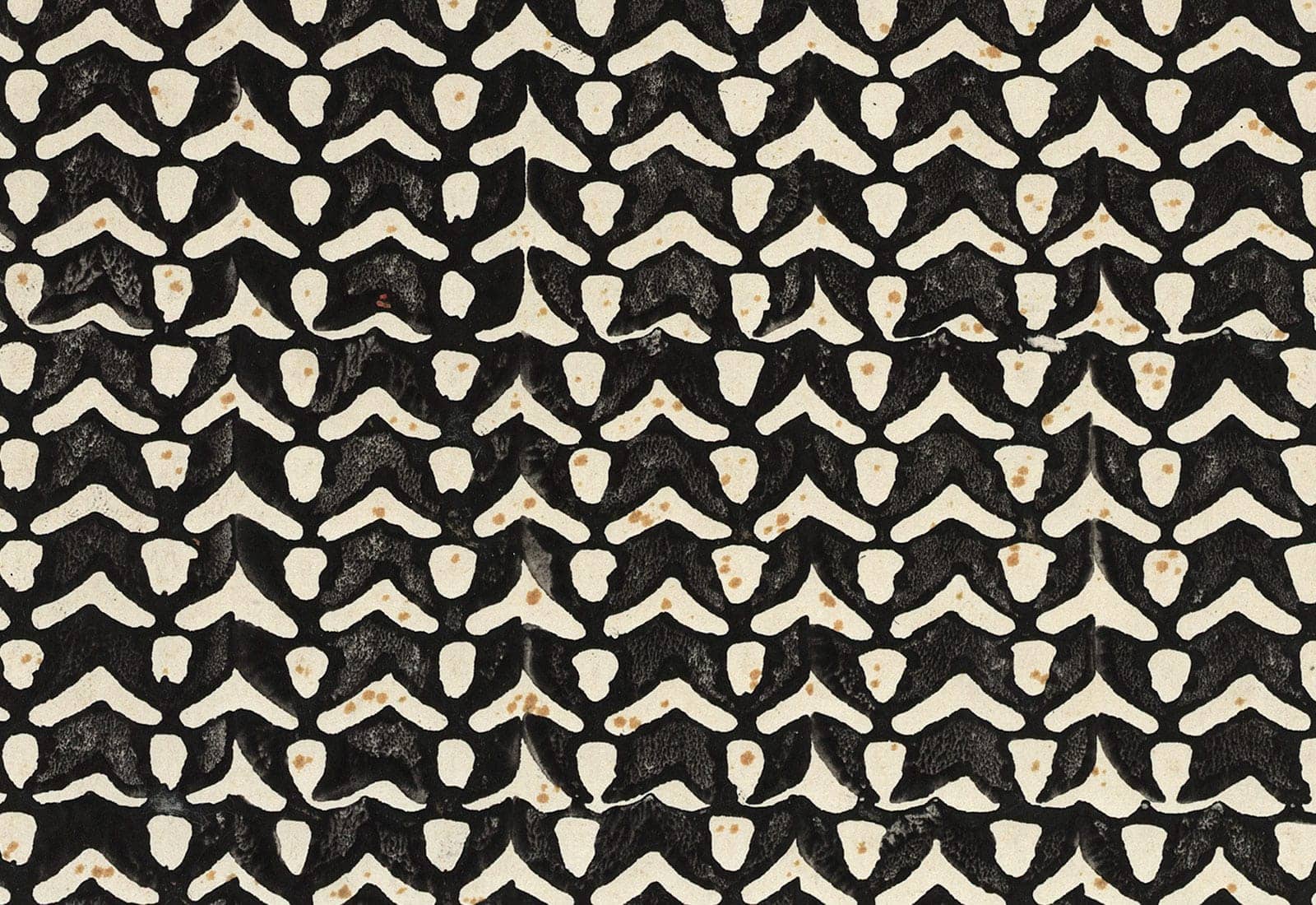
Czeschka-Schule: Pattern for endpapers, ca. 1905.
Updating a tradition
With enhanced significance and value, in the environment of the Secession, the Wiener Kunstschule and the Vienna Workshops, a technique that had been forgotten for centuries unexpectedly took off.
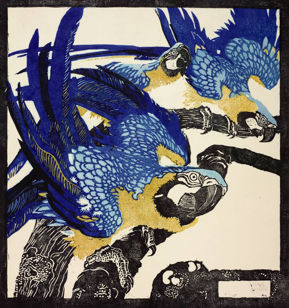
Ludwig Heinrich Jungnickel: Three blue macaws, 1909.
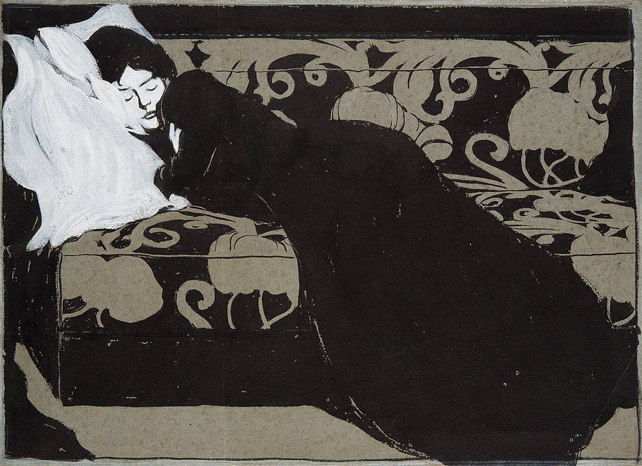
Max Kurzweil: The artist’s wife (Martha Kurzweil, sleeping on a divan), 1902.
hree printing panels with different surfaces together produce the color woodcut “Tiger head”. The more color nuances a woodcut displayed, the more laborious its production process, since each color required its own printing block. In order to reduce the number of printing panels to a minimum, some artists used enhanced contours as a design tool.
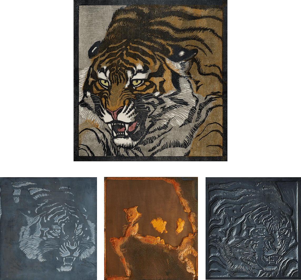
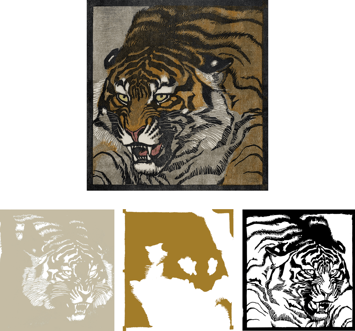
Ludwig Heinrich Jungnickel: Tiger head, 1909.
Ludwig Heinrich Jungnickel: Tiger head: printing block 1, grey plate; printing block 2, ochre plate, printing block 3, black plate, 1909.
Ludwig Heinrich Jungnickel: Tiger head: printing block 1, grey plate; printing block 2, ochre plate, printing block 3, black plate, 1909.
JAPANESE
INFLUENCES
Czeschka-Schule: Pattern for endpapers, ca. 1905.
Dream destination Japan
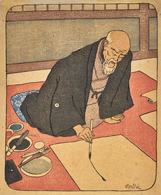
European artists were fascinated by the Japanese aesthetic. The Secessionist Emil Orlik traveled in the Land of the Rising Sun between 1900 and 1904 in order to study color woodcuts in situ.
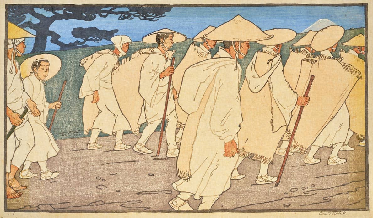
Emil Orlik, Japanese pilgrims on the way to Mount Fuji, 1901.
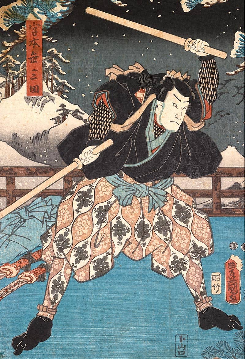
Utagawa Kunisada: The actor Nakamura Fukusuke in the role of the famous Samurai Miyamoto Musashi in the play Ichimuraza in Edo, dated May 23, 1856.
In the Land of the Rising Sun
Around 1854 Japan gave up its policy of isolation. This transition triggered a wave of enthusiasm throughout Europe for Japanese culture, which had been cut off from the outside world for over 200 years and had therefore remained free of outside influences.
Hand in hand
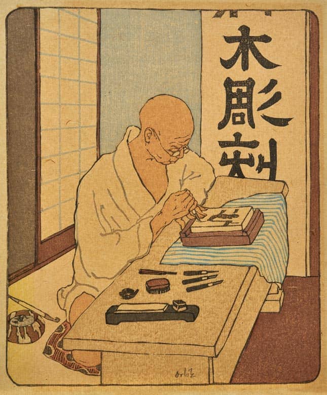
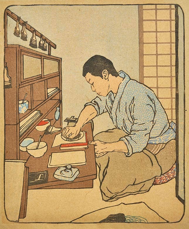
Emil Orlik demonstrates that the Japanese color woodcut developed as a joint production, with a division of labor between different individuals. Unlike in turn-of-the-century Vienna, in Japan the work of painting, woodcutting and printing was not all carried out by the same person.
A new era
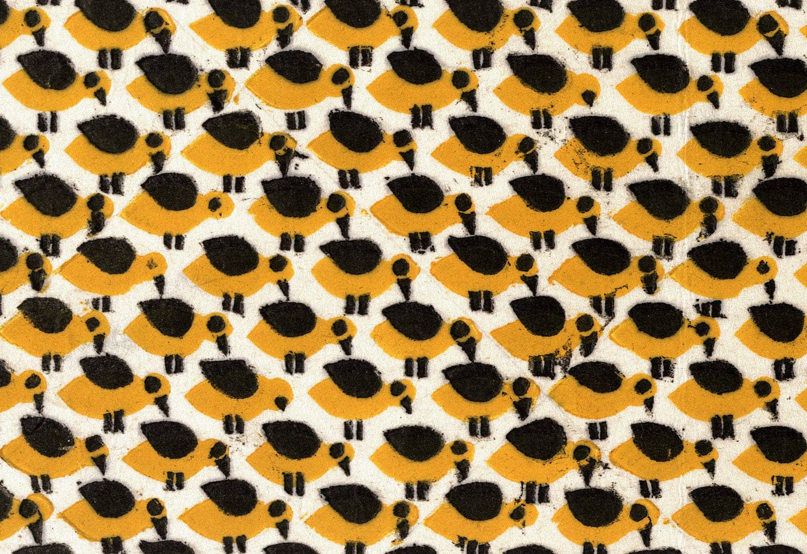
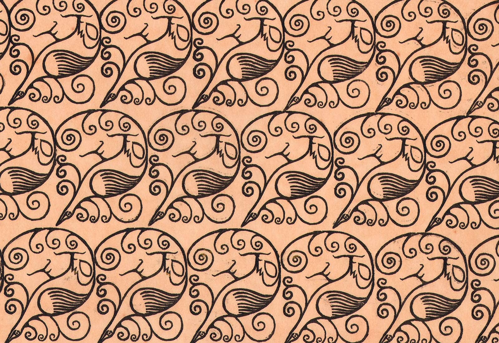
Kolo-Moser-Schule: Three Birds – pattern for endpapers, ca. 1905.
he resistance of the wood panel and the bulkiness of the material mean that the formal language of woodcuts must always be a reduced one. A particular quality of the Viennese color woodcut, however, is the continual further development of the design. A good decade before German Expressionism discovered the woodcut and its qualities for itself, in Vienna prints were emerging of a surprising modernity given the early date of their development.
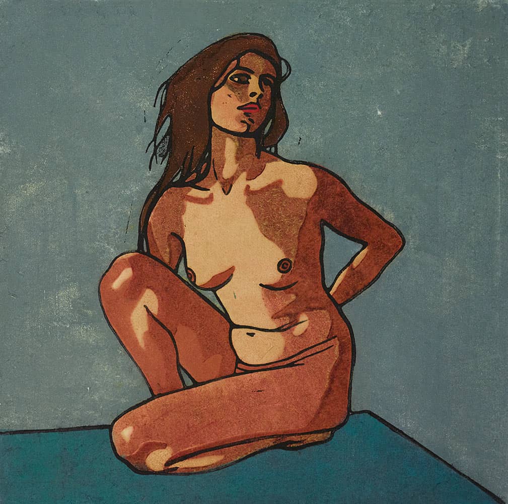
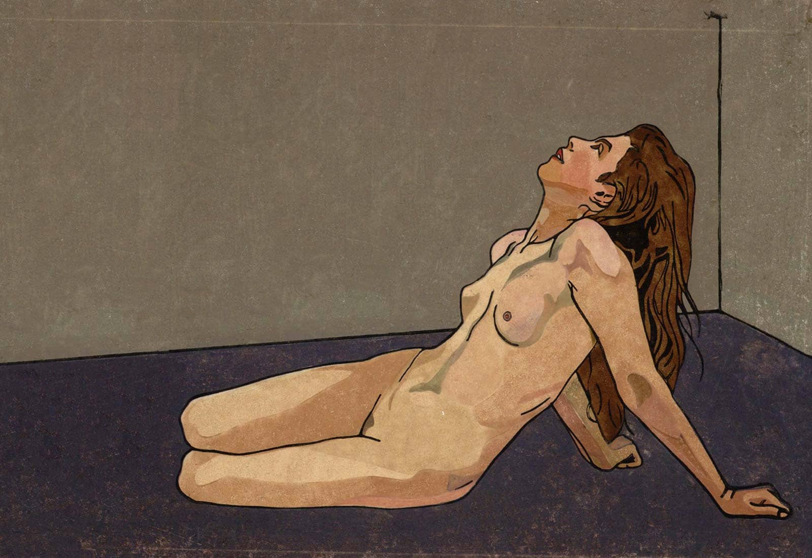
Carl Anton Reichel: Female nude study, 1909.
The body in the space
Abstract impression
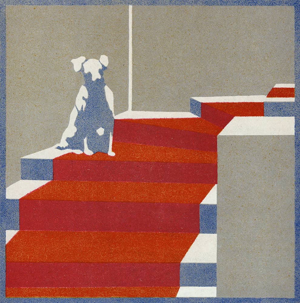
Nora Exner: Dog, reproduction from “Die Fläche” magazine (detail), 1905.
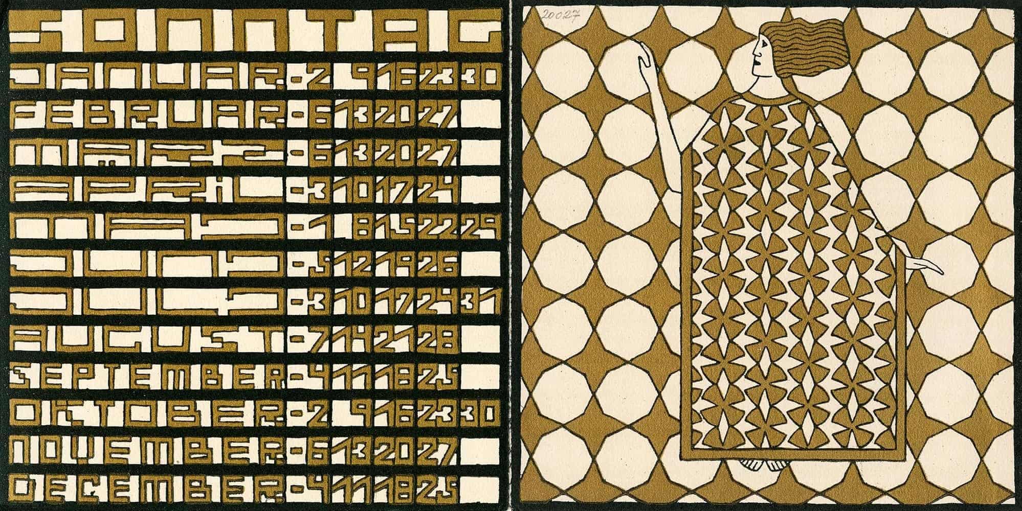
Ditha Moser: Calendar for the year 1910, Sunday.
The perfection of ornamentation
Most color woodcuts do not tell a story in the sense of actions, but rather depict subjects in a particular moment.
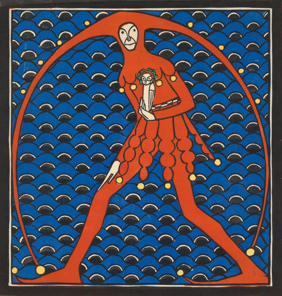
Anton Eichinger: Till Eulenspiegel, around 1903.
Pop 1900
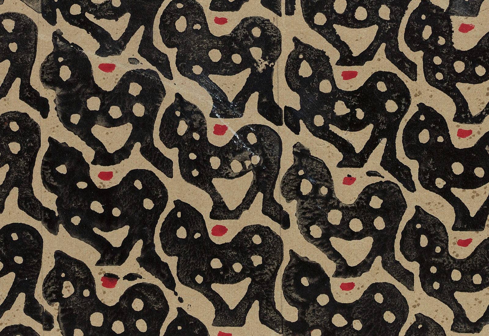
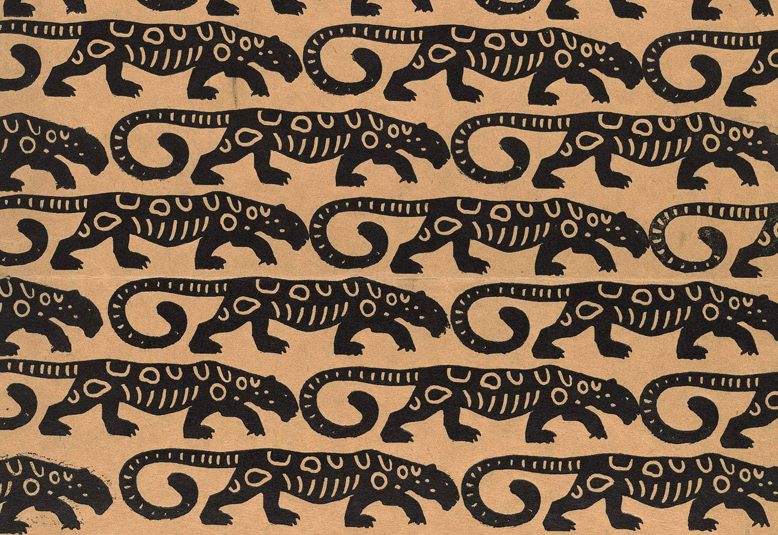
Marie Uchatius: Panther – pattern for endpapers, ca. 1905.
Viennese advertising
The reevaluation of the color woodcut in Vienna took place against the background of the contemporary enthusiasm for posters, advertising and illustrated books and newspapers. The demand for reproduced images was growing continuously.
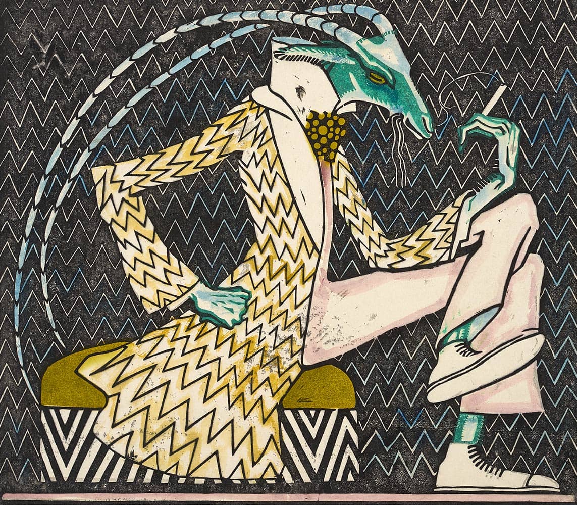
Ludwig Heinrich Jungnickel: Smoking cricket, 1910.
Art to go
0:00 min
Josef Hoffmann: The work program of the Vienna Workshops, 1904.
The magazine ‘Ver Sacrum’ is an appeal to the people’s appreciation of art for the stimulation, furtherance and dissemination of artistic life and cultural independence.
Ver Sacrum, 1898, S. 31.
ioneering: “Where do we come from? What are we? Where are we going?” is the title of Paul Gauguin’s final painting, which was created in the founding year of the Secession, 1897. The Frenchman – alongside Edvard Munch, the pioneer of the color woodcut – would no doubt have accepted the breakthrough of Viennese artists in the direction of Modernism as an answer.
After this little foray, visit the SCHIRN to discover for yourself the independent means of artistic expression the color woodcut became within the space of a decade. Expressionism? Pop art? Street art? We are excited to see which associations come to the minds of you, our visitors.
PERSONAL HINT
Marie Uchatius: Birds – pattern, s.a.
Which one can only glean from the original
Lightness of points – the spraying technique
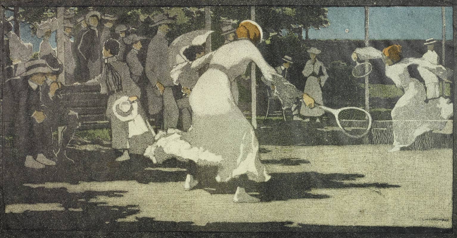
Ludwig Heinrich Jungnickel: Tennis player, 1905/1906, poss. 1903.
Ludwig Heinrich Jungnickel: Lawn Tennis (also: Woman Playing Tennis, The Tennis Court), 1905/1906, poss. 1903.